Axure RP is great tool for wireframing and rapid prototyping which I have been using for long now and Axure is going to introduce their new version soon.. Axure RP 8 beta.
Main highlights in Axure RP 8 are-
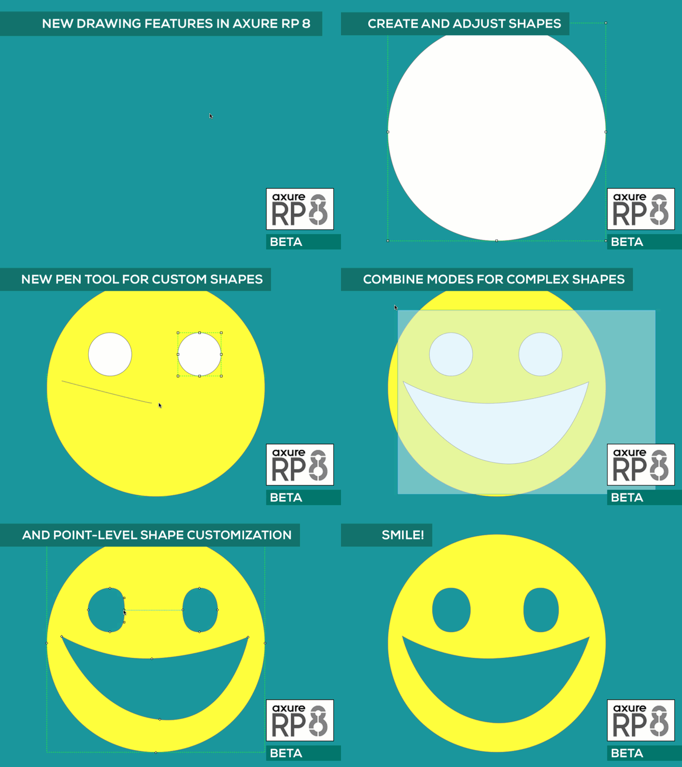
1. Axure RP 8: New Pen Tool
– Possible to draw custom shapes using new pen tool. We can also change their fills and borders. This is helpful for things like icons, charts, curved arrows, device outlines, buttons, and flow shapes,
2. Axure RP 8: New Animations and Interactions
Axure RP 8 will let you apply multiple animations to a widget that run at the same time, such as moving while fading. You’ll also be able to dynamically rotate widgets and set the size on shape widgets with easing. When setting panel states, a flip animation can be applied.
3. Axure RP 8: The Snapshot Widget
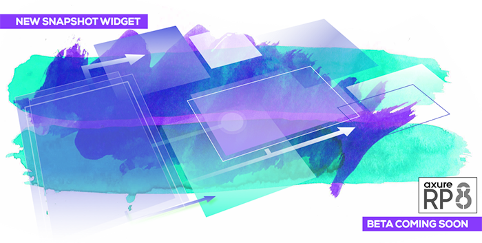
The Snapshot widget in Axure RP 8 is aimed at making it faster to create and update custom documentation. It captures an image of the page or master it references, and you can pan and zoom the snapshot to focus on a specific part of the page. The snapshot automatically updates when changes are made to the page.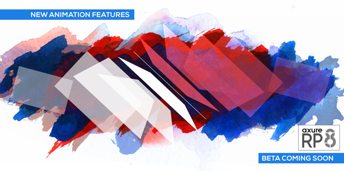
4. Axure RP 8: Print Guides & Print Configurations
In version 8, you’ll be able to specify the target paper size for your RP file as well as adjust the number of pixels that map to that size. Once you’ve setup a paper size, you can choose to show the print guides in the design area so you can lay out pages specifically for printing.
5. Axure RP 8: Team Projects on Axure Share
If you are using the Pro edition, you’ll be able to host Team Projects on Axure Share. Axure will take care of the servers, and you can focus on collaborating with your team.
6. Axure RP 8: Simplified UI
For example, a new Inspector pane on the right combines three separate panes from version 7 — “Widget Interactions and Notes”,“Widget Properties and Style”, and “Page Properties”. Moving the page properties from the bottom to the right freed room for the design area. Combining the widget interactions and properties allowed us to increase the size of the property and style buttons making them easier targets for your mouse.
Another example is that the toolbars within the “Pages” and “Masters” panes have been removed. The most commonly used buttons, like “Add Page” and “Search”, have been moved to the header of the pane. The remaining options are still available through context menus, shortcuts, and drag and drop.
 Those who wants to get newsletters and want to know more details about the changes…see it here
Content & Image Courtesy : Axure.com
